Page 24 - The Nationals - 2018 Gold WInners
P. 24
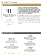
BEST LOGO DESIGN


GOLD AWARD


 This brand’s innovation lies in revolutionizing cottage life, by

taking the idea of the traditional, rustic cottage experience and

turning it upside down. Our logo reflects exactly this, its F flipped
backwards, to indicate that this is not your typical cottage getaway

– it’s an experience unlike any other. The backwards F places

emphasis on “Friday”– that day of the week you wish could last

forever, a promise of the weekend ahead.


The logo suggests: 365 days of Friday and the luxury of choosing

to spend each new sunrise however you please, without a worry

or care in the world, allowing the tedium of the week to be carried
away and dissolved with each gentle lap of lake water. The logo’s

brevity and ability to encapsulate a multifaceted feeling in just a
Friday Harbour

letter is incredibly impressive and impactful. Immediately you’re
Innisfil, ON, Canada

flooded with reveries of leisure and possibility. It offers the very
Builder: Geranium; Pemberton Group
distinct realization that there is something infinitely special about
Ad Agency: The Brand Factory
this place.


PLAY VIDEO


SILVER
AWARD


555TEN


New York, NY


Builder: Extell Development Company

Avora at Port Imperial
Marketing Director: Tamar Rothenberg

Weehawken, NJ
Ad Agency: CT Marketing

Builder: Landsea Homes

Marketing Director: Gabe Pasquale Arch Lofts


Ad Agency: New World Group, Inc.
Toronto, ON, Canada


Builder: Windmill Development Group

Baker Ranch
Marketing Director: Karen Moores
Lake Forest, CA
Ad Agency: blackiron agency


Builder: Shea Homes and Toll Brothers, Inc.

Marketing Director: Dottie Paek/Karen Ellerman Naples Reserve


Ad Agency: Gauger+Associates
Naples, FL


Developer: iStar Financial

Marketing Director: Heather Thompson
Ad Agency: Cotton & Company


24